
Red Hat
Red Hatis the world’s leading provider of enterprise open source solutions. They were looking for an agency who valued innovation and we showed them just that. The challengewas to elevate an old survey report and showcase your best interpretation of the data through a landing page, infographic, and web ads using brand guidelines. The goalwas to create an engaging experience for users that retained interest and provoked new thoughts and conversations from the findings.
Team
Kenny Rufino Creative Direction
Liviu Avasiloiei Art Direction
Ariana Velazquez Concept, Design, Illustration, Prototyping
Brand Elements


Our Approach
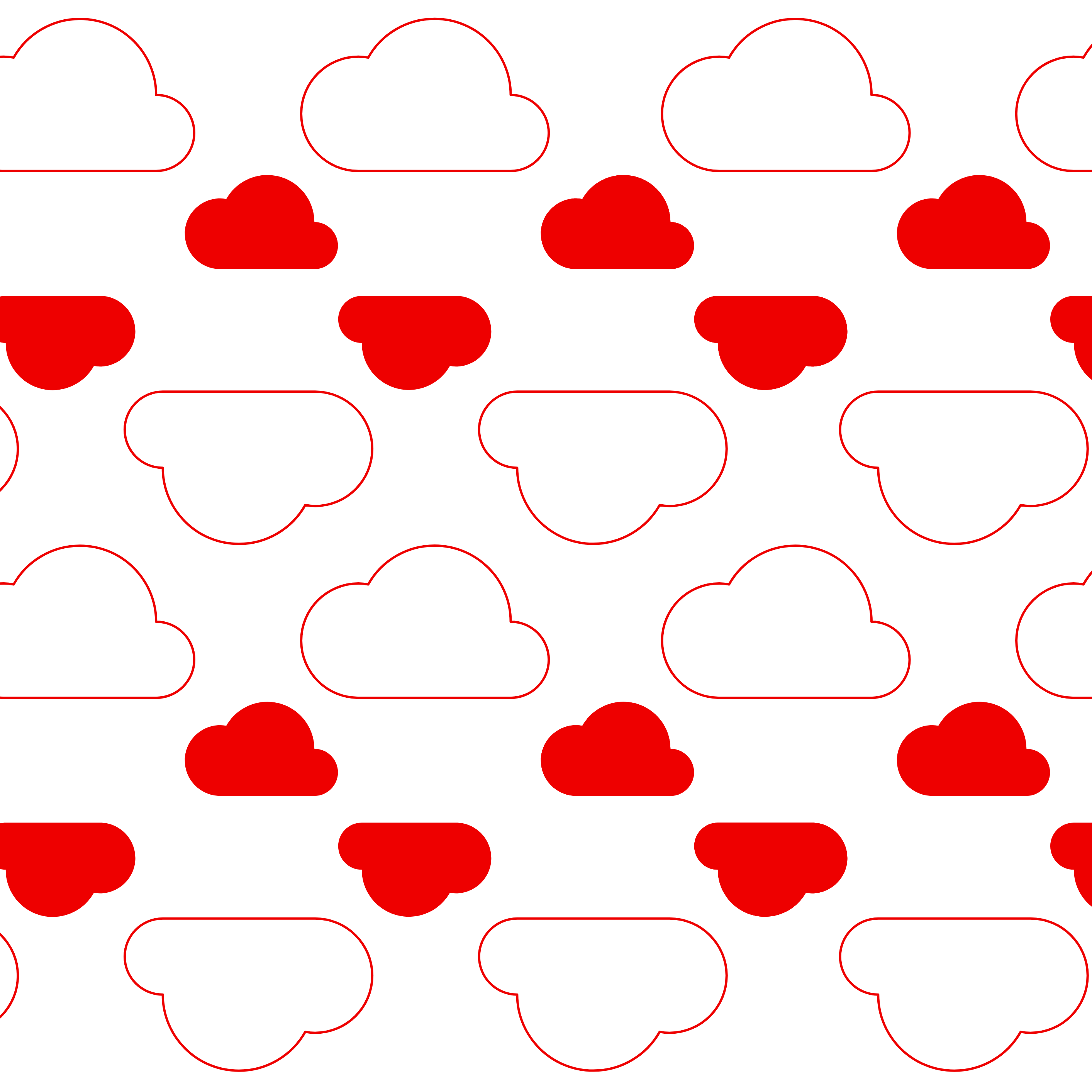
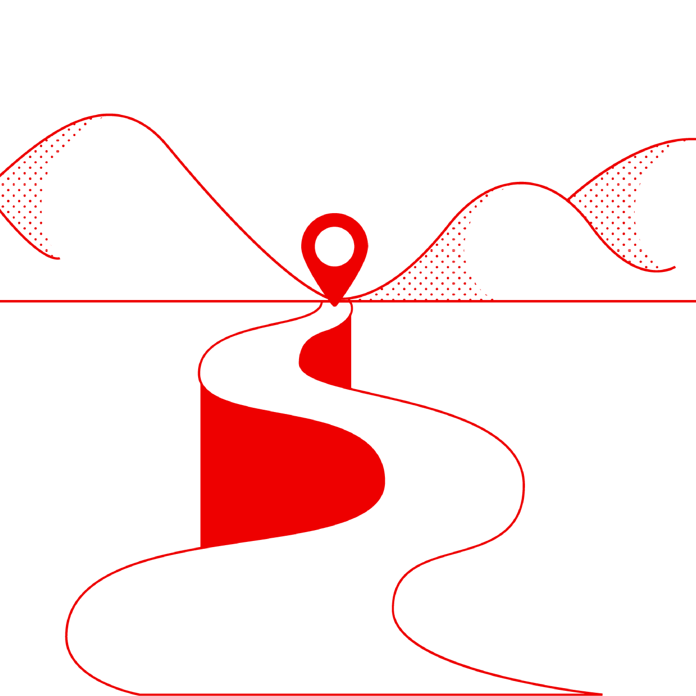
We wanted to reimagine and create new Red Hat illustrations using two separate shapes, the rectangle and the circle.
We decided this could be an exclusive style for all reports, speaking to all topics of data, technology, and code commonly visually represented through lines and dots. Illustrations on the left are our interpretation and the originals are on the right.
We decided this could be an exclusive style for all reports, speaking to all topics of data, technology, and code commonly visually represented through lines and dots. Illustrations on the left are our interpretation and the originals are on the right.


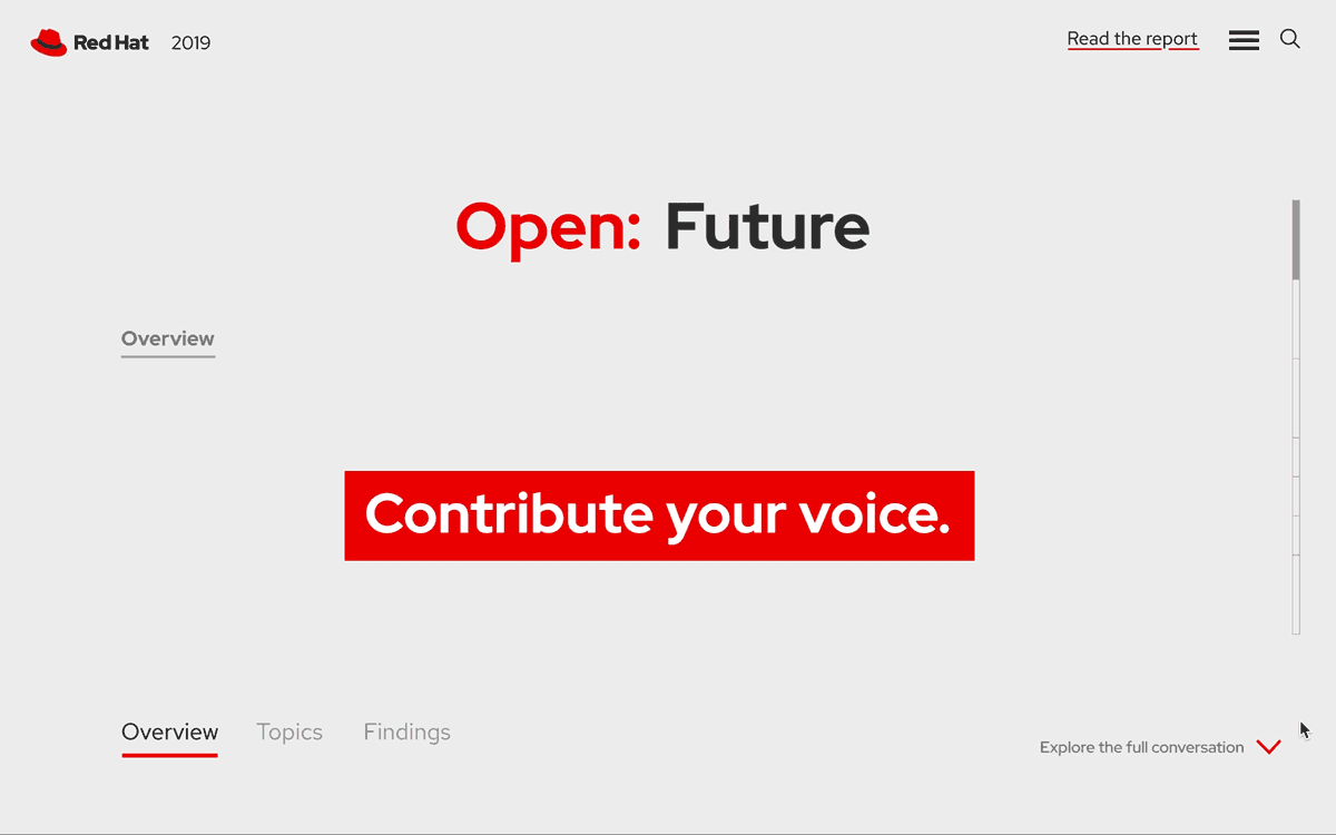
Landing Page
The landing page design was where most of our ethos and creative interpretation was going to come to life. We wanted an interactive experience where the data is laid out in easily digestible sections. This would give the user the opportunity to either explore specific areas of interest or follow one streamlined journey.

Topics Overview

Takeaways

The Experience
The user is always given the option toggle between tiers of information in the survey: data (topics), conclusions (findings), or a brief overview. In the data sections, users are given a option to further apply their findings by submitting opinions and exchanging ideas live.
This helps the experience appeal to audiences only looking for straightforward data as well as enthusiasts who enjoy further insight.
This helps the experience appeal to audiences only looking for straightforward data as well as enthusiasts who enjoy further insight.

Special Feature
By designing a message form at the bottom, a user would be able to submit an opinion on the data pages and explore other opinions by hovering over each dot, revealing another submission.


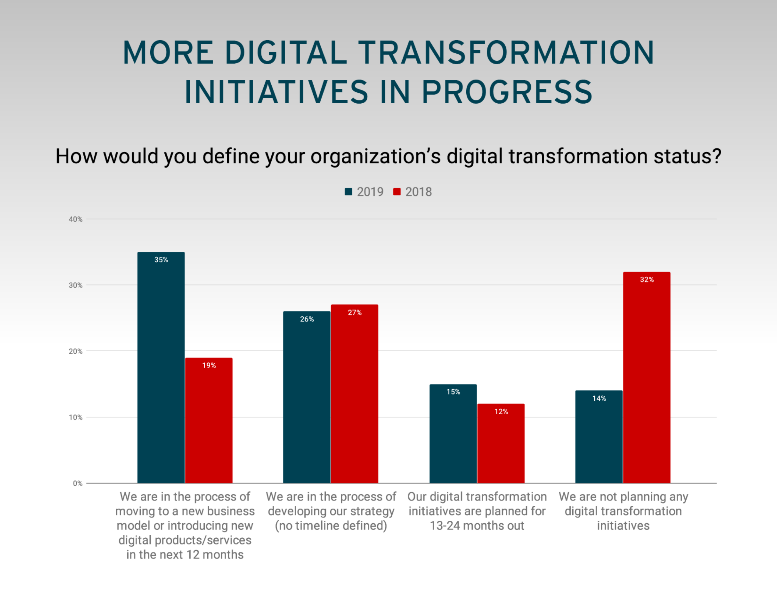
Data Visualization
The data was the most important part of the survey and the part that evolved the most in our redesign. Not only did we see great opportunity to streamline it with the illustrations and supporting elements we had, but there was also room to simplify the data visualizations for easier interpretation. We even built them out further with micro-animations, adding another layer of communication.


Additional Collateral
After fleshing out the design through the landing page, it was easy to carry it out through the remaining material. Creating simple patterns or incorporating some illustrations used in the survey helped tie the web ads in seamlessly, while graph styles were repurposed to fit a traditional letter page layout.


While our team was not selected to move forward, we made it to the top two contenders and I am still incredibly proud of the work we were able to create in just two weeks time. I gained a lot of experience on this project, working and learning with tight deadlines and collaborating with all faces of the agency.

